METISEKO BOUTIQUE in SAIGON
METISEKO BOUTIQUE in SAIGON
RETAIL • COMPLETED • 2017
COLLABORATION: Structure and MEP Design (Khang Nam Engineering),
Main Contractor: (Giacat Co)
Finishing Contractor (Minh Chuong Co)
Lighting Design (ELEK)
Construction Management (Atelier MoDat)
PHOTOGRAPH: Brice GODARD
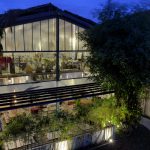
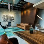
T3 just finalized the new METISEKO boutique on the famous Dong Khoi Street in Saigon. The challenge was first to bring METISEKO brand a step ahead to Luxury, but keeping his previous “soul”; secondly, make a luxury shop in a “poor” existing building by creating a kind of patio offering a much more interesting volume to the shop and inviting customers to go upstairs. T3 did it! Reusing some decorative elements of the brand (wooden bricks, wood carving…), mixing them with new contemporary elements, quite minimalist and composed by some luxury materials: traditional lacquered furniture, authentic stucco walls and decorative panels, brass metal frames…. In the interior “courtyard”, T3 decided to create an infinite ceiling, by installing mirrors on the wall and ceiling, having traditional Hoi An lanterns flying up to the virtual sky… Color palette defined by T3 is quite neutral: white, grey, balck; METISEKO products bringing the colours through their unique fabrics, tailor-made clothes and scarves as well as their wonderful fashion photos. Lighting was properly designed to highlight the products and create a cosy environment for customers.
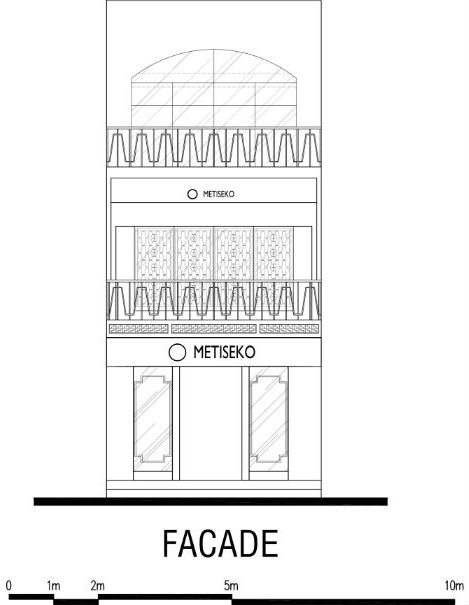
FACADE of METISEKO on Dong Khoi Street
The main goals of any retail is to invite guests to enter into their boutique. That’s why T3 paid attention to design properly the 2 facade displays facing the Street, to catch their attention and curiosity. Then, T3 decided to limit the color palette to some basic: Black, gold/brass and white ivoire…. adding some plants on the balcony to bring the tropical atmosphere and Metuiseko brand identity.
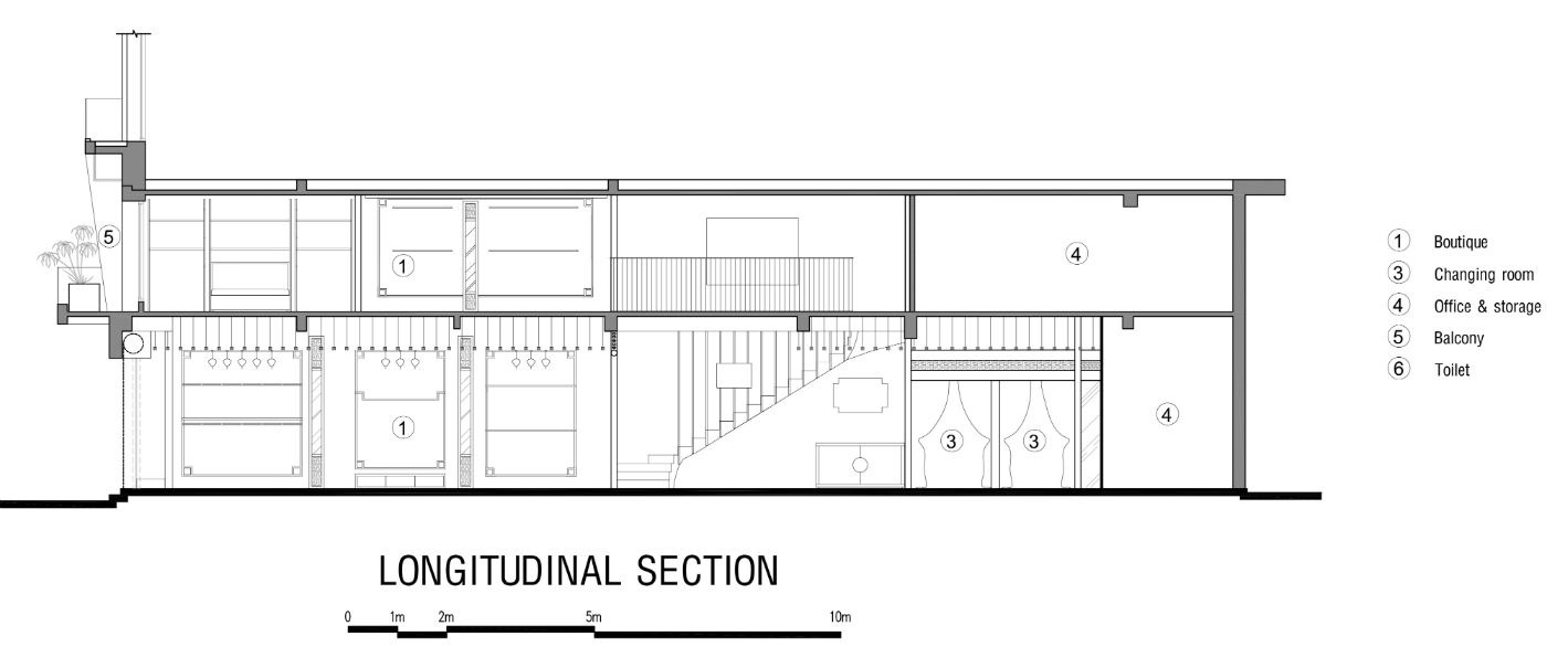
SECTION of METISEKO BOUTIQUE
Interior Patio designed by T3 attract guests/clients to the 1st floor.
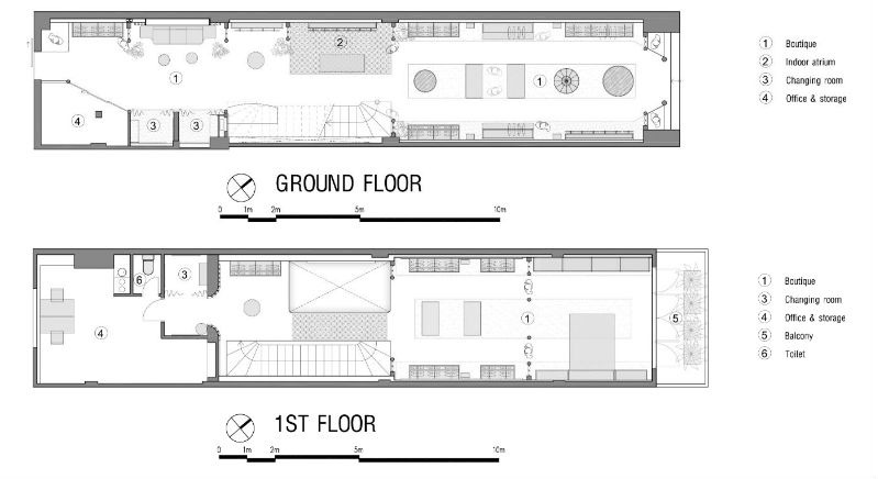
LAYOUT EFFICIENCY
The main issue for all Retail being on 2 levels is to manage to bring people at the upper floor. That’s why T3 decided to create an “interior Patio”, inspired from traditionnal “courtyard House” in Hoi An, as to attract the guests to the 1st floor. The mirrors installed on walls and ceiling create a unique space which give the impression to get a building with many floor, by reflection. Creativity is one of the best way to make people curious, and invite them to discover the space, it means increase the sales…


